
A lot of thought and reflection went into our LOGO Design.
The Placement of Symbols
UNITY / SUPPORT - embracing and bringing together the DIVERSITY/ EQUITY in the individuals; families; language, and within our communities
The Words
A CALL TO ACTION - by ALL for Full and Meaningful INCLUSION (All these words are Verbs!)
- Support / Soutenir
- Empower / Habiliter
- Include / Inclure
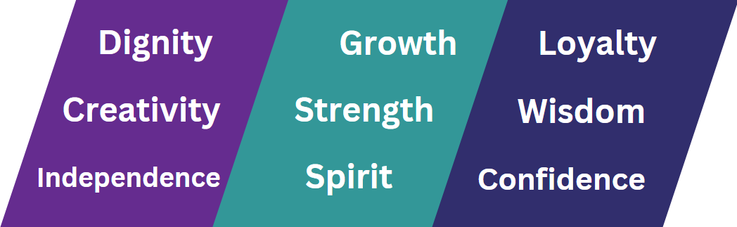
The Colours
Teal conveys: growth, strength and spirit
Purple conveys: dignity, independence, and creativity
Navy Blue conveys: loyalty, wisdom and confidence
The 3 Figures
- INCLUSION / SUPPORT/ EQUITY
- the people we serve through the Partnerships between our association & the community
- the 3 Counties we serve Westmorland, Albert & Kent (South East NB).
The Wave represents
- the CURRENT of our association’s ADVOCAY flowing through our community
- the EMPOWERMENT – giving Voice to (and when necessary for) the Individuals & families through our association’s ongoing ADVOCACY
- the ACHIEVEMENTS and the efforts, actions within our communities towards INCLUSION
The Name Change from Community Living
Over the years our movement has grown to represent more than just living in community. Being in community does not necessarily mean being of community and we must strive to raise the bar and set a new standard for real change for something greater: full and meaningful inclusion.
Since our association was founded more than 35 years ago by a small group of families, our name has changed as we responded to new challenges and opportunities.
In the past, individuals with developmental disabilities were often labelled "mentally retarded" or "mentally handicapped." Many were placed in institutions, segregated schools or workplaces with little or no pay. This association as with others across this country was founded by parents who dreamed of a better life for their sons and daughters. They wanted their children to learn in school, work in real jobs, have friends, and be welcome in their communities.
Over the past more than 35 years, our local association has grown from a committee of the former CP and MR association to an incorporated body that includes individuals, families, volunteers, and community members dedicated to making sure that people with developmental disabilities are able to enjoy their right to lead active and productive lives in their communities.
Changes in our name THEN and AGAIN NOW reflect changes in our understanding of people with intellectual developmental disabilities and societal changes.
“The ACL name is rooted in Canadian history . . . when we were closing institutions and moving people back to the community. The name was also influenced by individuals with intellectual disabilities whom advocated for and were successful in having the associations across the country to have a name that reflected this change in thinking and didn’t label them in terms of their disability”.
Language that we used at one time to describe individuals with an intellectual disability is now considered to be insulting and hurtful.
Societal change made it necessary to drop outdated old language that reflected negatively on people with developmental disabilities.
The name “Inclusion Advocacy SENB / Promotion de l’inclusion SENB"...
Better represents:
- the focus (including the geographical area), of our efforts, and
- that we, all: play a part in making our communities better places to live for everyone, whatever their ability;
- are in this together;
- and ensure the individuals, we represent and serve, are seen 1st and foremost as individuals and their disability is secondary.
IN SUMMARY:
Inclusion Advocacy SENB Promotion de l’inclusion SENB is:
- A More Current reflection of our work of a New Era a New Generation the Quest for an Inclusive life Societal . . . context more groups;
- A More accurate reflection of the geographical area we serve South East NB
- A More inspirational name We aspire to advancing inclusion across life span and across all community sectors;
- It will hopefully make it Easier to understand what our efforts are directed at what our hopes and dreams are;
- Reflects a Movement more about facilitating inclusive lives focus on growing up in community having an inclusive life;
Indeed, community living is the essence of who we are and who we always will be.
As we so well know, the power of words, the power of a name cannot be underestimated. Inclusion Advocacy SENB Promotion de l’inclusion SENB, better reflects our values, will engage people and states clearly that we are about INCLUSION.
Inclusion Advocacy SENB Promotion de l’inclusion SENB is looking ahead. Building on our past successes, our parents, families and the individuals we serve, looking and working towards an ever better “BRIGHTER FUTURE”.